
Marketing 101 : 4 Things Vinyl decals can do for your small business
Capture Foot Traffic The average person has the thought that window signage is just informational. Nothing more than an oversized business card. But with a…

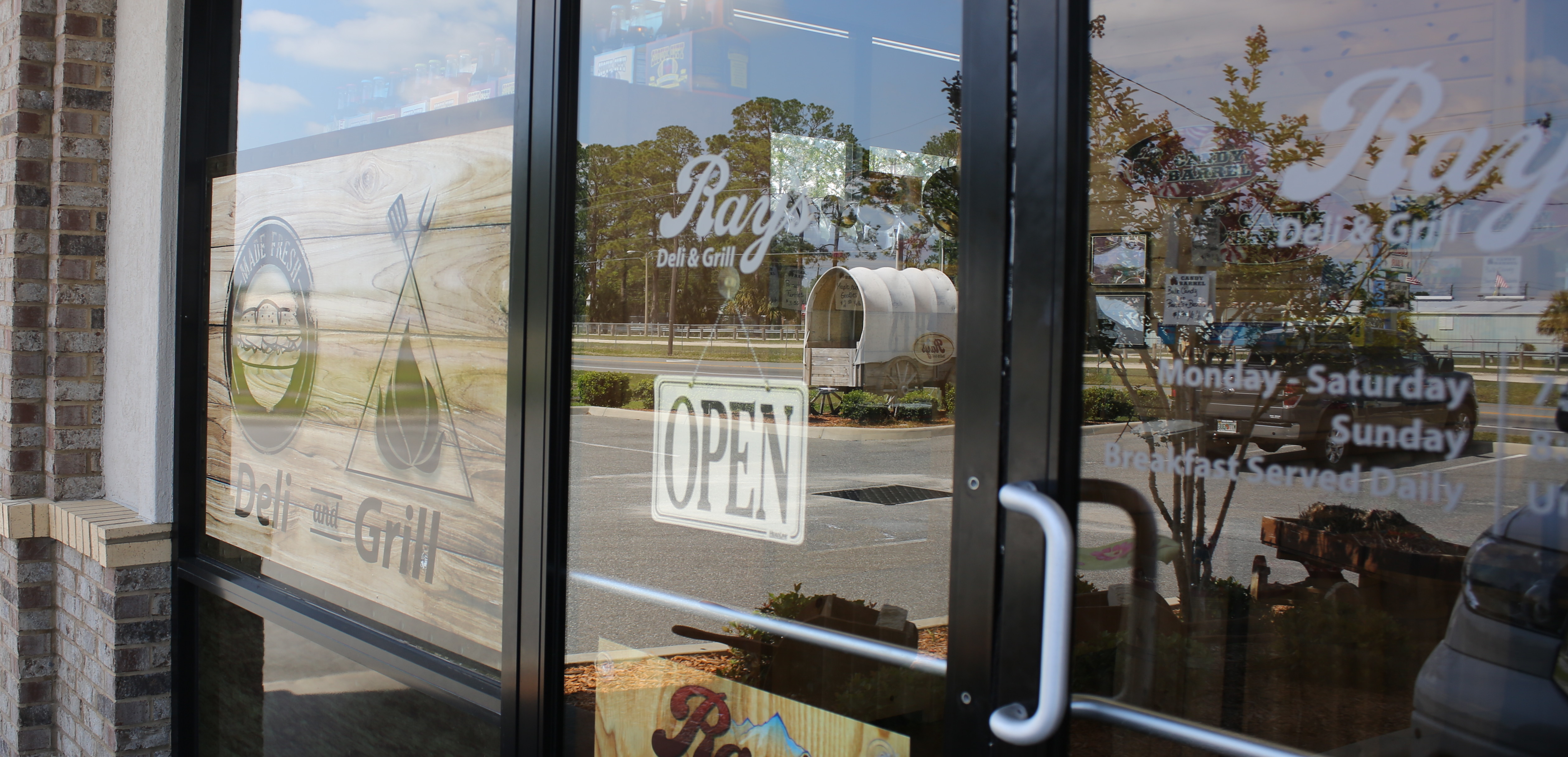
How To Apply Window Decals To Your Storefront?
How to Apply Window Decals to Your Storefront?So you've taken the time to order decals and lettering for your storefront and they are finally ready to be installed.…
3 Benefits of Custom Aluminum Signs
In signage, rugged, lightweight building materials have become the prized possession of marketers, vendors and contracting companies looking to leave their mark…
Advantages of Custom Wall Decals and Floor Decals
We've all walked into a local business and had one of two experiences, either A: we walk inside the establishment and are welcomed by well crafted establishment…
Seek Help from a Reputed Company for Manufacturing Vinyl Letters
We've all been there before, you convince yourself 'how hard could it be?' and your spirit holds strong until the fateful day when it's time to bring action to words.…
Use Safety Signs to Protect Citizens
From business parking lots to property signs, Safety Signs serve the greater purpose of keeping citizens protected and educated from otherwise harmful elements.…
The Best of Static Clings for Windows at Speedy Signs
The best static cling for windows is the static cling that works for you. Static Cling, a non-sticky adhesive vinyl material that can be applied to windows and other…
Choosing the Perfect Company for Window Lettering
You'd be mistaken to think that all Window Lettering companies are the same. Window Lettering has been an age old tradition since the early days in American history;…
The Psychology of Color in Signage
Color psychology can play a very important role in signage. Weather you are re-designing your current business signage, or perhaps you are looking to purchase some…
Bright Lights and Sweet Signs
Nashville, Tennessee is one of the most popular and well known cities in America, boasting it's reputation for famous musicians and music culture in general. Kitty…
Font Fun
Fonts are a huge part of the design process when creating anything that has words involved. I personally enjoy a good font, and if allowed, would sit on font sites…
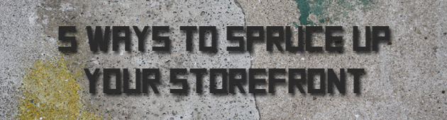
5 Ways to Spruce Up Your Store Front
Something that I am finding to be more and more true as I live life and take on new projects is that success is not about how MUCH you have, it's about using WHAT…
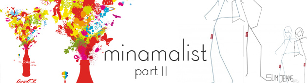
Minimalist Pt. II
I wrote a blog post on here the other day on Minimalism that has kept me thinking. You see, minimalism, while an excellent choice of design style (especially for…
Marketing Your Small Business With Signage
Becoming a SUCCESSFUL small business these days is no easy feat, and I know this because I see it every day here in Columbia County. A store front down town will…
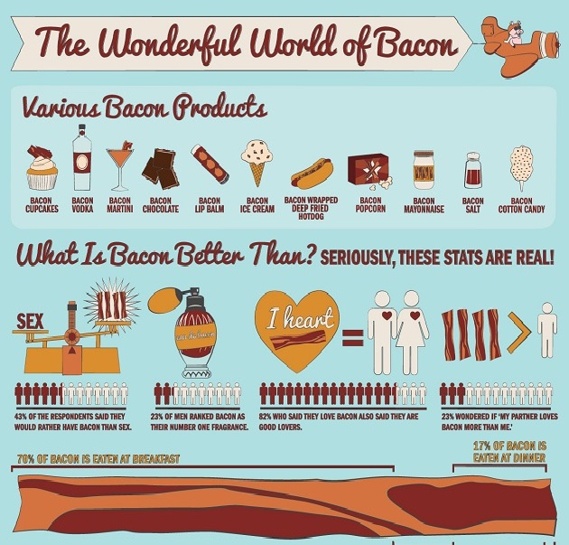
Top 10 Favorite Infographics
I don't know who made the first infographic (I should probably look that up), but whoever it is, I'd like to shake their hand. Infographics are a brilliant and attractive…

Best Movie Posters 2012 Part 1
I'm a big fan of the movies. In fact, it is one of my favorite things to do alone. Weird, right? I love sitting in the movie theater by myself and disconnecting…